Visualizing Girl Talk
And moving on from facebook visualizations yesterday, a wicked look at the mashup artist Girl Talk’s last album.I wish I’d found this, but this came from my friend @anu . Awesome. First off, if you haven’t grabbed Girl Talk’s mashup album, you can grab it here (and pay for it later or not, but this guy seriously deserves some cash for his efforts, dontcha think?).
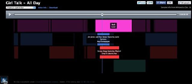
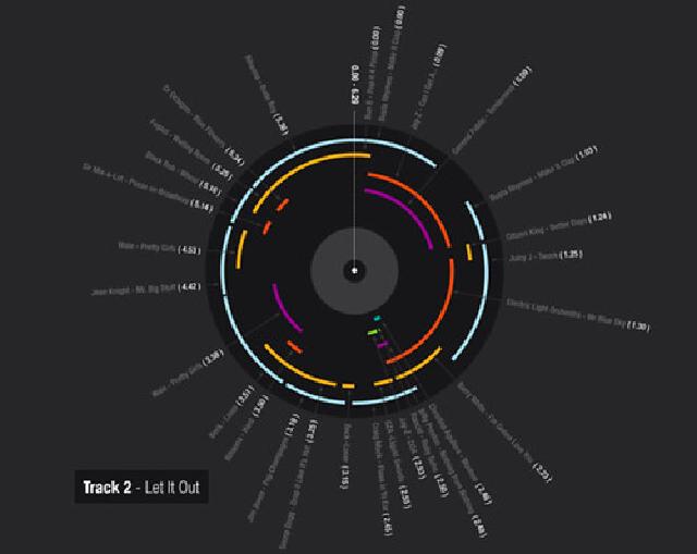
This amazing interactive interface from Mashupbreakdown shows you while the song is playing where those mashed up tracks are coming from. A brilliant way to represent it. I so wish you could interactively remove tracks from the mashup though to see how the thing is put together. So very cool though.

Also on that note, [Fast Company has a very good, if much less cool infographic with all the Girl Talk songs along with a short snippet on the Girl Talk guy (left his job as a biomedical engineer, how cool).

Really starting to lurv these visualization and data representation ideas and data journalism. I mean, I know there’s a lot of snake oil out there, but you have to love what some people are doing with freely available (or proprietary and really big) datasets to mess around with. Does anyone doubt how valuable some of these might be for things like Gov 2.0 and the like?