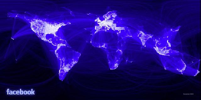
Visualizing Facebook's Social Graph
Wow, this is pretty impressive. An intern at facebook decided to do some major data crunching to visualize and answer questions about how people connect to each other and how local they are. Super interesting (if not surprising) visualization of how we connect to each other through the ubiquitous fb.

It’s kind of amazing (anyone else struck by how facebook is still a very “first world” problem. This would be a cool thing to release for individuals to check out their map of the world as well I think (I know how obsessed I am with collecting pins on my world map in iPhoto since they introduced the feature. So sad.
I’m really hoping this guy shares a lot more detailed technical notes as super interested in how he slammed that many data points into something this interesting. I know he started out with R< (which I lurv) and was interested (though again, not surprised, but would love to see its design) that facebook uses Apache Hive (on top of hadoop and, in particular, MapReduce) for its data warehouse. Not to mention how big a beast of a machine he must have used (“after a few minutes of rendering”… ).
I really am loving this trend towards extracting amazing things out of large datasets.