#Datasci

  • Budget Cutting Infographic

    Fantastic infographic from Information is Beautiful cutting through all the crap to give a clear picture of what each political party is forwarding in order to cut Britain’s whopping £167B deficit if they get into power. Love it for its clarity and conciseness.
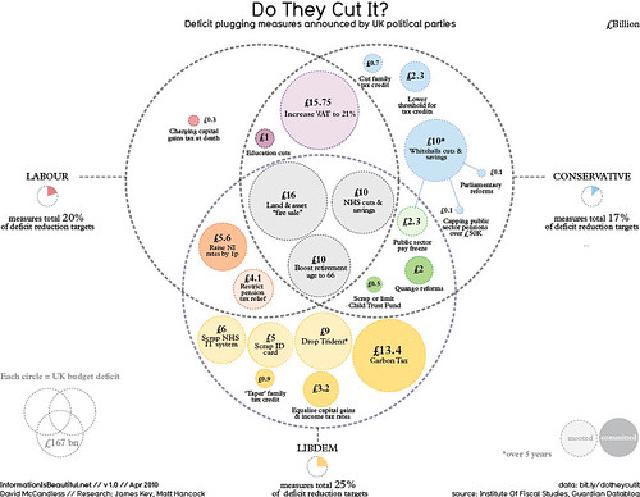
    UK political party deficit cutting measures

    I need this sort of graphic for the Australian election as well.
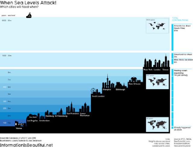
  • When Sea Levels Attack

    Let’s face it, no one really knows what scientists mean when they refers to a one metre rise in sea levels. Information is beautiful tries to make it clear for everyone through the Guardian’s Data Blog .

    When Sea Levels Attack - Information is Beautiful

    Just wondering where Vancouver and Sydney would rank on the graph.

  • Social Network Analysis using R Presentation

    OK, a bit dry, but a very interesting presentation (from a super geeky perspective) on using the open source package R and some nice libraries for doing social network analysis of data sets.

    Can definitely see how I can use this for community segmentation in an interesting way.

    Doing a bit of work on community actor identification for the new gig (or at least looking at how we can get some tools together to automate analysis).

  • Mapumental your London neighbourhood

    I love the work the folks at MySociety are doing these days. Mapumental is a great bit of geekery allowing someone to figure out where they can live based on commute, housing prices and scenery. Check out the jaw-dropping demo below since the thing is still in private beta. I so wish they would have this for rental prices added in.

  • Open Source Business Intelligence in the real world - MySQL Conf 09

    Interesting presentation from MySQL Conf 09 on open source adoption and the use of open source Business Intelligence tools.

    BI is about getting stuff out. Everything else is about getting stuff in. Transaction processing is a commodity, analysis is not. And really, the problem with most organizations (including my own current one) is being able to use their information, not capture it.

    The problem is that DW and BI tools, at least commercially, are really expensive. My last company spent about $250k just getting their reporting and OLAP suite sorted (pricey BOBJE in case you were wondering). So, the business case upside for open source BI is huge.

  • Scary ass interactive map of job losses across the USA

    Slate has a really excellent map of vanishing jobs over time since January 2007 the in the US. The story starts off with blue net job growth and red losses and proceeds like one of those zombie outbreak movies where the red starts breaking out all over.

    A bit scary ass for all my friends in the United States, but very interesting. I would have done this a bit more smoothly (and possibly in flash), but it’s a nice visualization of a very scary trend as well as letting you examine point in time data a bit better.

  • Understanding relational and key-value store databases

    While a title like Is the Relational Database Doomed? is obviously link-bait, this Read-Write Web article on the differences between relational databases and the current rapid rise of key-value pair data stores (particularly for distributed, rapidly scalable, multi-tenant web applications) is excellent.

    Obviously, relational databases (like MySQL, Oracle, DB2 etc.) aren’t going anywhere soon, but the use of key-value pair stores, as well as their recent resurgence with things like Amazon’s SimpleDB , Google’s Big Table , CouchDB and a host of others, and understanding where it might be a good idea to use them, makes this article a great primer if you’ve been wondering.

  • Comparative job losses chart for the current recession

    Re-posted from BoingBoing. This is, as they say, one “scary-ass job-loss chart.”

    {{ figure src="/images/farm4/3472/3264714648_c0f939cee2.jpg" title=“Comparative job losses across recessions” }}

    This is from Nancy Pelosi, the current Speaker of the House’s blog. This is what 3.6 Million jobs lost over 13 months looks like . It plots the last two recessions against the current recession (the green line doing the scary death dive.)

  • Bittorrent world connectivity map

    The fine buccaneers at The Pirate Bay have published an interactive map of people seeding and leeching torrents ~~bad link~~~ around the world with data by country (percentage users and connections through country at a given time).

    Great and fascinating snapshot of p2p activity globally. China is far and away the highest poller and well over 30% of world activity every time I’ve looked. Would be even cooler I think if you could divide this into seeders and leechers with these stats.