#Datasci

  • Visualizing Girl Talk

    And moving on from facebook visualizations yesterday, a wicked look at the mashup artist Girl Talk’s last album.I wish I’d found this, but this came from my friend @anu . Awesome. First off, if you haven’t grabbed Girl Talk’s mashup album, you can grab it here (and pay for it later or not, but this guy seriously deserves some cash for his efforts, dontcha think?).

    This amazing interactive interface from Mashupbreakdown shows you while the song is playing where those mashed up tracks are coming from. A brilliant way to represent it. I so wish you could interactively remove tracks from the mashup though to see how the thing is put together. So very cool though.

  • Visualizing Facebook's Social Graph

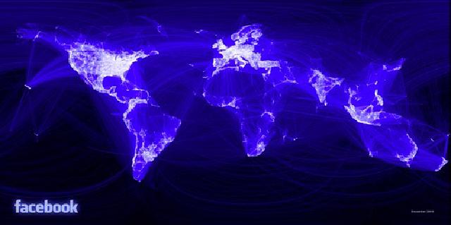
    Wow, this is pretty impressive. An intern at facebook decided to do some major data crunching to visualize and answer questions about how people connect to each other and how local they are. Super interesting (if not surprising) visualization of how we connect to each other through the ubiquitous fb.

    Facebook’s global social graph

    It’s kind of amazing (anyone else struck by how facebook is still a very “first world” problem. This would be a cool thing to release for individuals to check out their map of the world as well I think (I know how obsessed I am with collecting pins on my world map in iPhoto since they introduced the feature. So sad.

  • How Not to Cock Up Open Data

    Great post on how not to cock up open data and how amazing it is to be even having a conversation about it at all.

    1. Argue for it as a numbers game. Not all gov data sets will yield huge value, but some definitely will
    2. Cease tinkering around and build something useful as a service
    3. Obsessively gather information on what value is generated by people using the data
    4. Keep an eye on public servants who might inadvertently share private or sensitive data
    5. Mistakenly insisting that Government really should be in the business of publishing everything non-private it can

    Great list actually. I really, really need to get down to some of those Gov 2.0 hack days going on in Canberra and Sydney.

  • Creating a Data Driven Startup

    Really love this tough-love talk on metrics for your startup and how you should implement and kill features based on what they do to the bottom line. Awesome, if ugly (and annoying it does a bit of sales pitch, but hey).

    via Ringo .

  • FedEx's Changing World

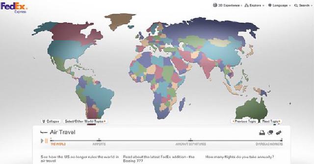
    FedEx has come up with an amazing morphing world data map dead link, pulling data from the Economist Intelligence Unit showing how specific figures change the shape of the world. Interesting comment on our changing world.

    FedEx - Our Changing World

    Has some nice factoids on the loading animation as well (though it is a bit tardy to load, at least here in Aus). Make sure to hit “Next Topic” when each “reel” is done since some of them are damn fascinating.

  • How to be a data journalist

    Absolutely awesome DIY Guardian article by noted pioneer and leader in the field of data journalism Paul Bradshaw from how to source, munge, and report the facts in a coherent form from oceans of available data. Facts are sacred.

    I love this article and the Guardian, who does wicked work in this area, for being awesome enough to publish it and to show people how to do it themselves. Very, very cool.

  • Fossil fuel subsidies in America

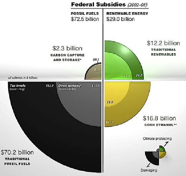
    Fantastic visualization of how the US subsidizes fossil fuel production versus renewables. Really would love to see this for Canada and especially Australia (where the question of renewables is much on my organization’s and the electorate’s mind heading into a federal election.).

    Fossil fuel subsidies

    One point that should be made: Not all fossil fuel subsidies are evil. For instance, low income home heating assistance is actually something good even if it falls under those auspices. But it’s clear from the graph that for a more independent and sustainable future, America has a ways to go. ANd most of the renewables subsidies are from ethanol-based subsidies (which is really just propping up the farming sector).

  • How Strong is Your Password?

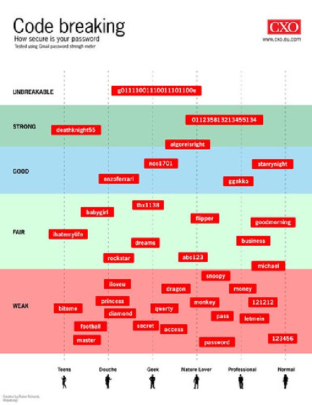
    Another absolutely fantastic infographic via Information is Beautiful from CXO magazine on both how strong your password is and a nice extra layer of sociological categorization.

    How Strong is Your Password?

    Mind you, I don’t think the top one is strong enough IMHO. Mine’s better… ;-)